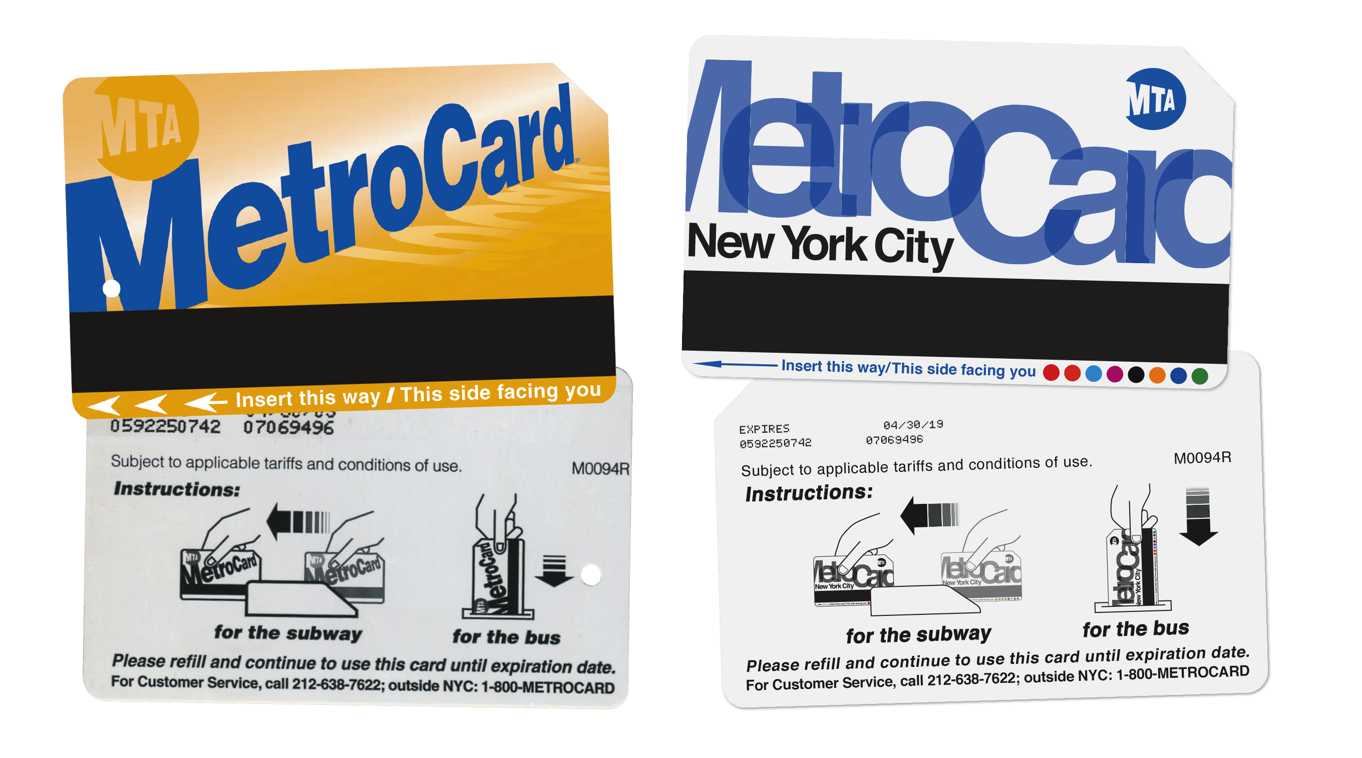
NYC Metropcard Redesign
The NYC Metrocard is an iconic and essential part of daily life in New York City. However, its design has remained largely unchanged since its introduction in the 1990s.
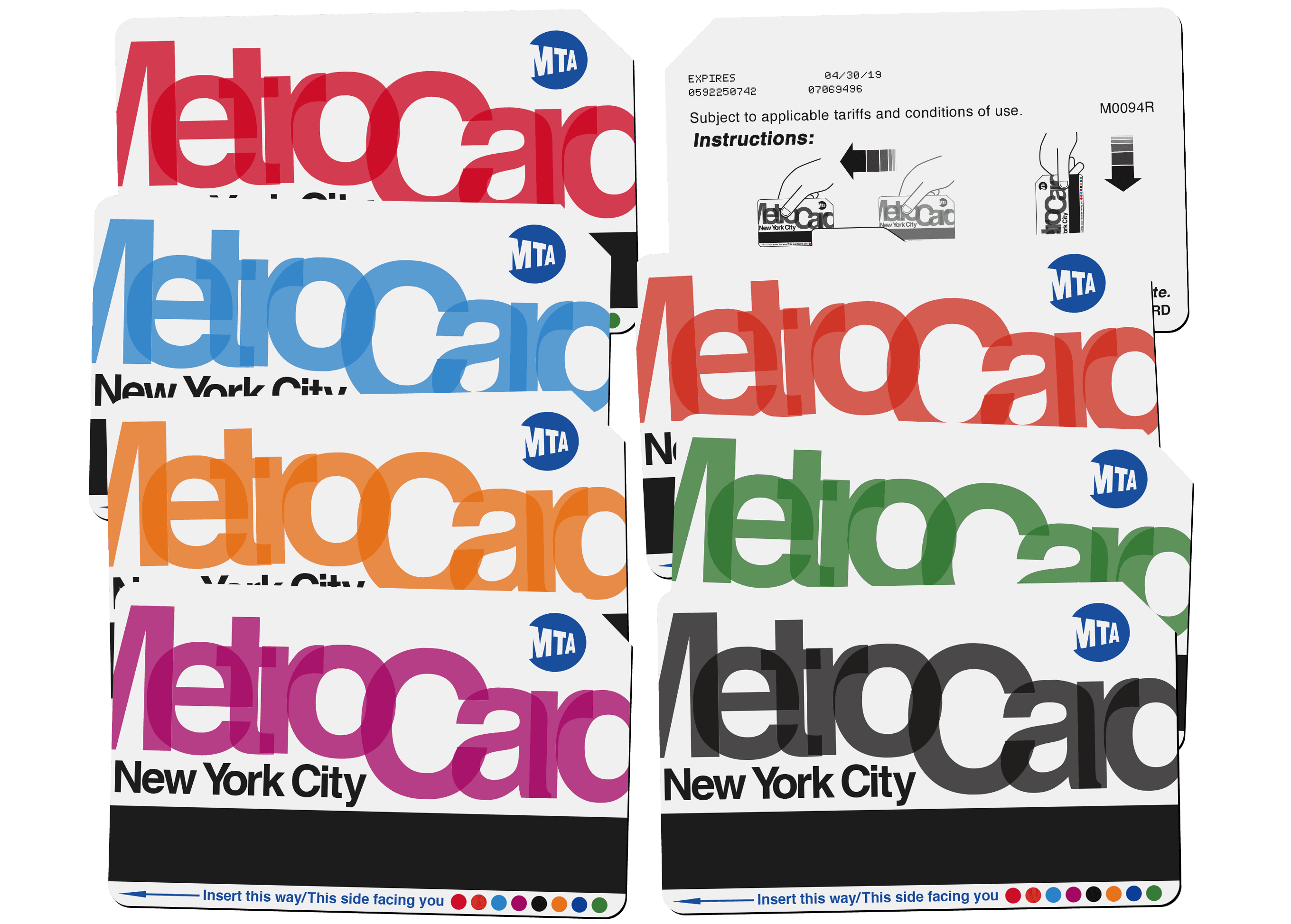
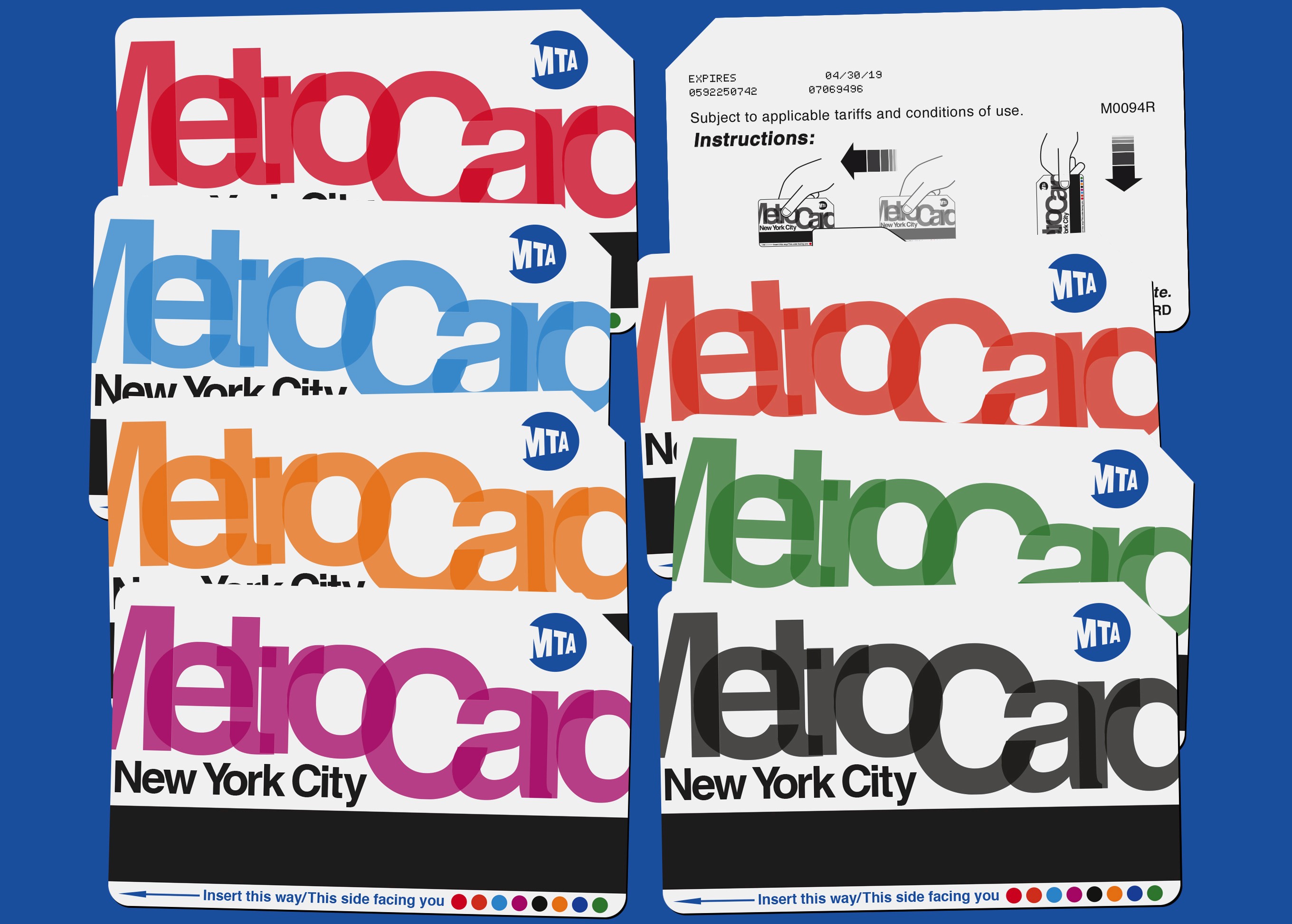
As a graphic designer with a passion for modern and colorful design, I decided to take on the challenge of redesigning the NYC metrocard. My goal was to create a new design that would be more reflective of the city's vibrant and diverse culture, while also incorporating modern design elements and technology. The inspiration for the new design came from New York City subway stations’ aesthetic. Incorporating Helvetica, my intention was to stay consistent. Stylizing the classic font similar to all of the signs found hanging in every subway station, MTA maps, & subway cars. Each Metro Card comes in 8 diverse color ways, getting away from the iconic, gaudy gold.
I began by conducting research on the history and significance of the Metrocard, as well as analyzing the current design and its limitations. I then created a series of sketches and digital mock-ups, experimenting with different color schemes, patterns, and images.
After several rounds of iteration and feedback, I arrived at a final design that I am proud of and that I believe would be well received by the people of New York City. The new design features a bold and colorful pattern, inspired by the city's diverse neighborhoods and cultural heritage. Overall, this passion project was a great opportunity for me to exercise my creativity and design skills, and to imagine a new and improved version of an important part of New York City's identity.
